


Prometheus - Ampersand Shirt
To celebrate Prometheus’ midnight release, we thought you might enjoy an ampersand shirt featuring the major ships depicted in the Alien universe.
Experimental Typography: “Breakfast Barrettos”
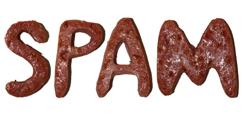
While making my morning meal the other day, I started to wonder how each ingredient I was mixing in might look on its own if it were to “spell itself.” I set out to display the contents of my favorite burrito recipe by utilizing some experimental typography. I ended up becoming excited by the results you see below, so I wrote out the instructions for preparing the foods as well and added that in. I’ve included a PDF download at the very bottom to act as the first page of an ongoing “Graphic Recipe” book. Any ideas for what recipe to create next?
Read more…
Resources: Type Foundries Online

If you’re looking for a fresh font for a specific project or to impart an identity on a brand, you want to find something that is functional but distinctly grabs the eye. Here are some online type foundries that offer fonts that can help you to achieve that bold effect.
Read more…
Online Typography Resources
Typography is something that is so pervasive that most of us don’t think twice about it. Here are some great resources for learning about typography and different types of fonts.
Read more…
Typography: Comparing Typefaces

When I look around the world that lies outside, I see many different things. One thing that stands out to me is signs. My eyes naturally scan the letters that are on the signs and, aside from just reading the words that they form, I also take note of the typeface that they use. Now there are thousands of different typefaces out there, so one can imagine how difficult it can be to pinpoint exactly which one they are looking at. What makes it even more difficult is the fact that many typefaces look the same; however, if one takes the time to notice and remember the slight differences between these typefaces, it will be easier to distinguish one from the other. One typeface may have longer ascenders than the other, or it might have a bigger x-height- whatever the difference is, it’s just a matter of knowing which characteristics to look for. For this post, I will compare the Arial typeface to Helvetica, and Gotham to Avenir.
Read more…
Epic Unboxing – House Industries: Bad Neighborhood
Another package from House Industries, another unboxing!
Design and Arts Inspirations TypographyEpic Unboxing – House Industries: Rat Fink Font
We received this package from House Industries and decided to film ourselves taking it out of the box to show off the design of the contents. Alice and I had a very “cinematic” experience opening the box, so we hope you enjoy watching it!
Design and Arts Inspirations Typography