


Color of the Year: Pantone’s Zeitgeist Chroma
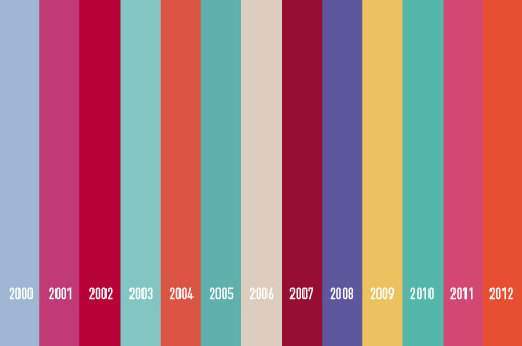
Last month Pantone announced Tangerine Tango as the “color of the year” for 2012. Executive director of Pantone Leatrice Eiseman described the hue as “sophisticated but at the same time dramatic and seductive.” Great, but what made Tangerine Tango a better choice than Passionate Purple? Or Bombastic Blue? Or Requiem Red? Well according to Pantone, the chosen color is meant to act as a guide through which our culture’s current zeitgeist is being channeled.
Read more…
Online Art Resources

Art is a vast subject that changes frequently and often radically with time. Here are some interesting, informative, and inspirational art-oriented websites to keep you in the know and inspired with fresh material.
Read more…
Branding: How Much Can You Take Away?
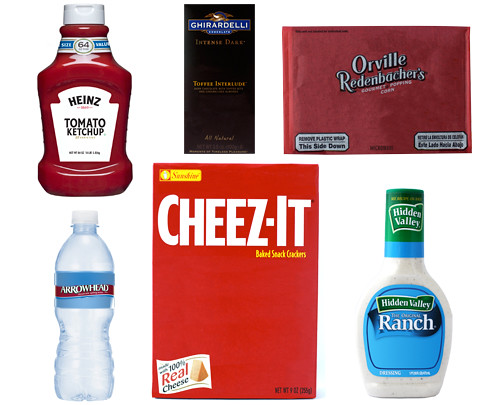
When scanning a grocery aisle for our favorite products, it’s usually easy to spot what we’re looking for. Brands we’ve grown familiar with have packaged their items in such a way that it’s more of a search for the visual graphics that represent them, rather than for the brand name itself. We decided to take some familiar packages and observe how strong our associations are when key components are taken away.
Read more…
Online Typography Resources
Typography is something that is so pervasive that most of us don’t think twice about it. Here are some great resources for learning about typography and different types of fonts.
Read more…
Branding: Brand Identity Flags

Much like a country’s flag, a brand’s identity is supposed to represent the brand as a whole. Looking at some of the most recognizable brand identities, one of the things that stands out the most is the colors that are used. Why were these colors chosen? What do the colors mean? What do they mean to the company? These are some important questions to ask when considering which colors should represent a brand. In this entry, 16 brand identities were turned into flags to represent each brand as if they were countries. The prevalence of each color was taken into consideration in making these flags.
Read more…
Star Wars: A Galaxy Without Limits

In anticipation of the upcoming release of Star Wars: The Complete Saga on Blu-ray, we are posting a Star Wars themed post every day this week.
In today’s blog, we’re looking at the Imperial Tourism Bureau’s newest advertising campaign to attract intergalactic travelers to Imperial space: A Galaxy Without Limits.
Read more…
Typography: Comparing Typefaces

When I look around the world that lies outside, I see many different things. One thing that stands out to me is signs. My eyes naturally scan the letters that are on the signs and, aside from just reading the words that they form, I also take note of the typeface that they use. Now there are thousands of different typefaces out there, so one can imagine how difficult it can be to pinpoint exactly which one they are looking at. What makes it even more difficult is the fact that many typefaces look the same; however, if one takes the time to notice and remember the slight differences between these typefaces, it will be easier to distinguish one from the other. One typeface may have longer ascenders than the other, or it might have a bigger x-height- whatever the difference is, it’s just a matter of knowing which characteristics to look for. For this post, I will compare the Arial typeface to Helvetica, and Gotham to Avenir.
Read more…
Epic Unboxing – House Industries: Bad Neighborhood
Another package from House Industries, another unboxing!
Design and Arts Inspirations TypographyEpic Unboxing – House Industries: Rat Fink Font
We received this package from House Industries and decided to film ourselves taking it out of the box to show off the design of the contents. Alice and I had a very “cinematic” experience opening the box, so we hope you enjoy watching it!
Design and Arts Inspirations Typography