


[TUTORIAL] How To Choose Between Four Color Or Spot Color Printing

During a recent project, I ran into some bumps while prepping an Adobe Illustrator file for a printer. After a bit of research, I was able to answer a lot of my own questions regarding the differences between a Four Color Printing and Spot Color Printing. I’ve decided to take that experience and translate it into a few tips that will hopefully help anyone faced with a similar situation.
Read more…
Childhood Pantone Swatch – Pokemon Edition

Here’s another addition to my collection of cartoon swatches. This time I’ve decided to make swatches of my favorite Pokemon characters.
Read more…

Color of the Year: Pantone’s Zeitgeist Chroma
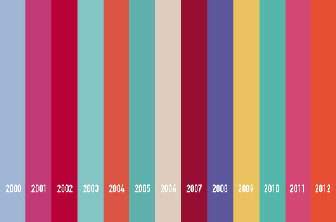
Last month Pantone announced Tangerine Tango as the “color of the year” for 2012. Executive director of Pantone Leatrice Eiseman described the hue as “sophisticated but at the same time dramatic and seductive.” Great, but what made Tangerine Tango a better choice than Passionate Purple? Or Bombastic Blue? Or Requiem Red? Well according to Pantone, the chosen color is meant to act as a guide through which our culture’s current zeitgeist is being channeled.
Read more…